Case study
01
/
04
Immis Cakes
Client
Immis Cakes
Sector
Bakery
Scope
Full Brand Identity
Year
2025
The short of it
A concept brand identity project for Immis Cakes & Bakes, a popular cake shop in Newport
The brief
Immi’s Cakes & Bakes has experienced a significant rise in popularity within the local community of Newport and is now preparing for expansion. To support this growth, the brand requires a refreshed visual identity that is both scalable and contemporary, while still retaining the charm and personality that customers know and love. The new identity should remain playful and approachable, preserving the brand’s core values, but evolve into a more refined and versatile system. This will enable Immi’s to expand into new locations, introduce mobile delivery services, and strengthen its overall brand recognition. The goal is to create a cohesive and modern brand that connects more deeply with customers, enhances visibility, and supports long-term growth across multiple touchpoints.
The idea
Immi’s Cakes & Bakes blends playful charm with a strong sense of community, offering baked goods that feel both joyful and familiar. As it expands, the brand looks to elevate its identity into a more modern and scalable system without losing its approachable, well-loved character.
The doing
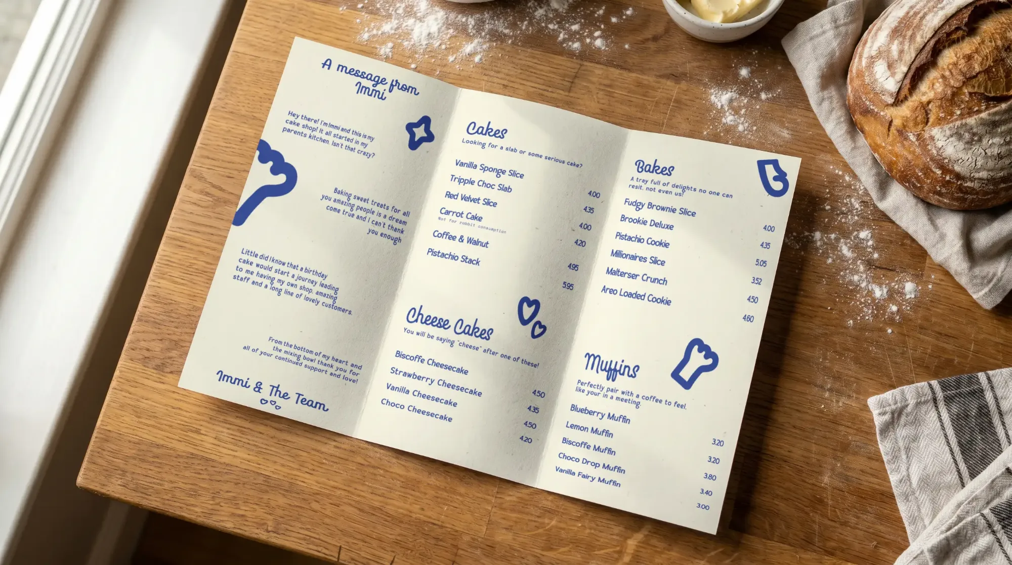
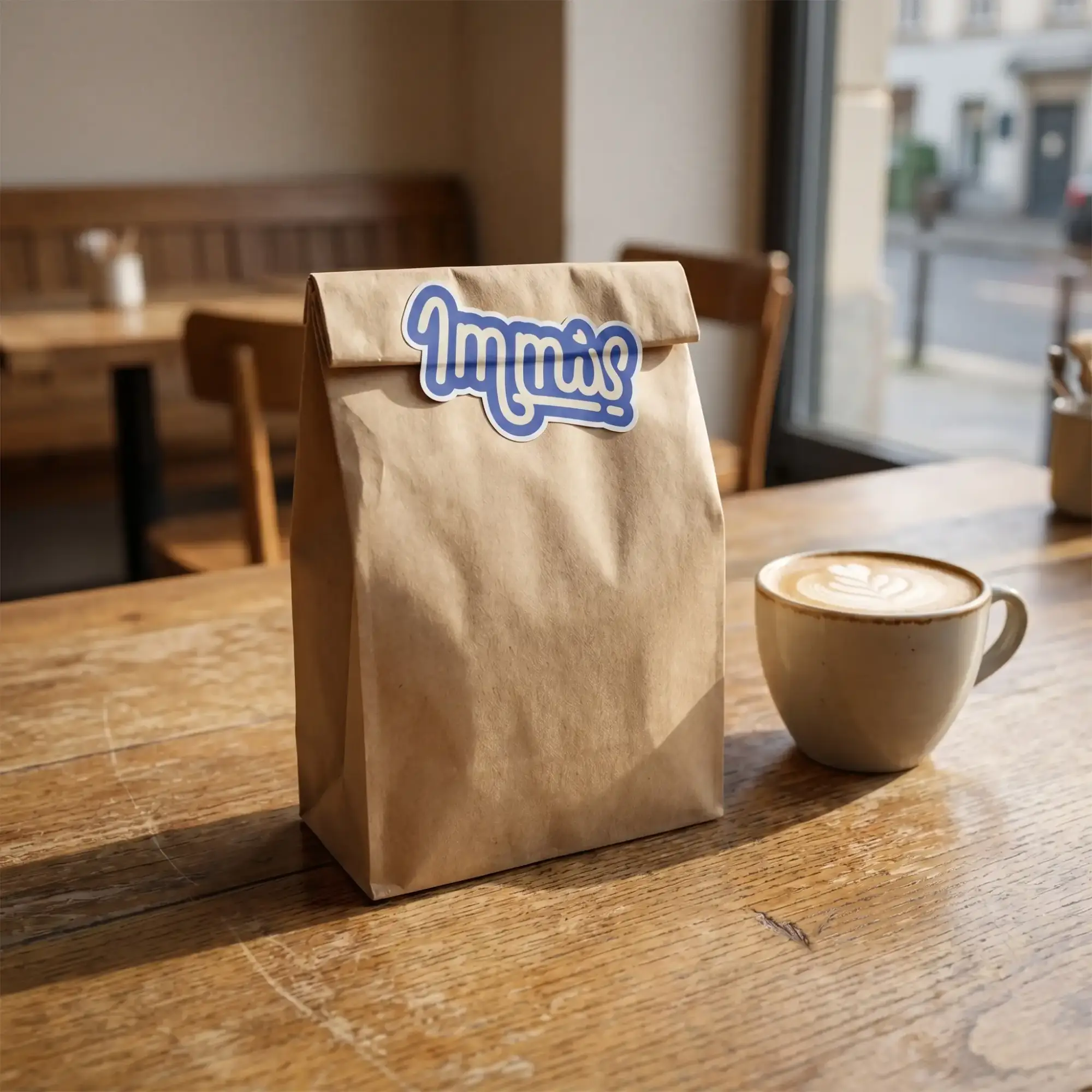
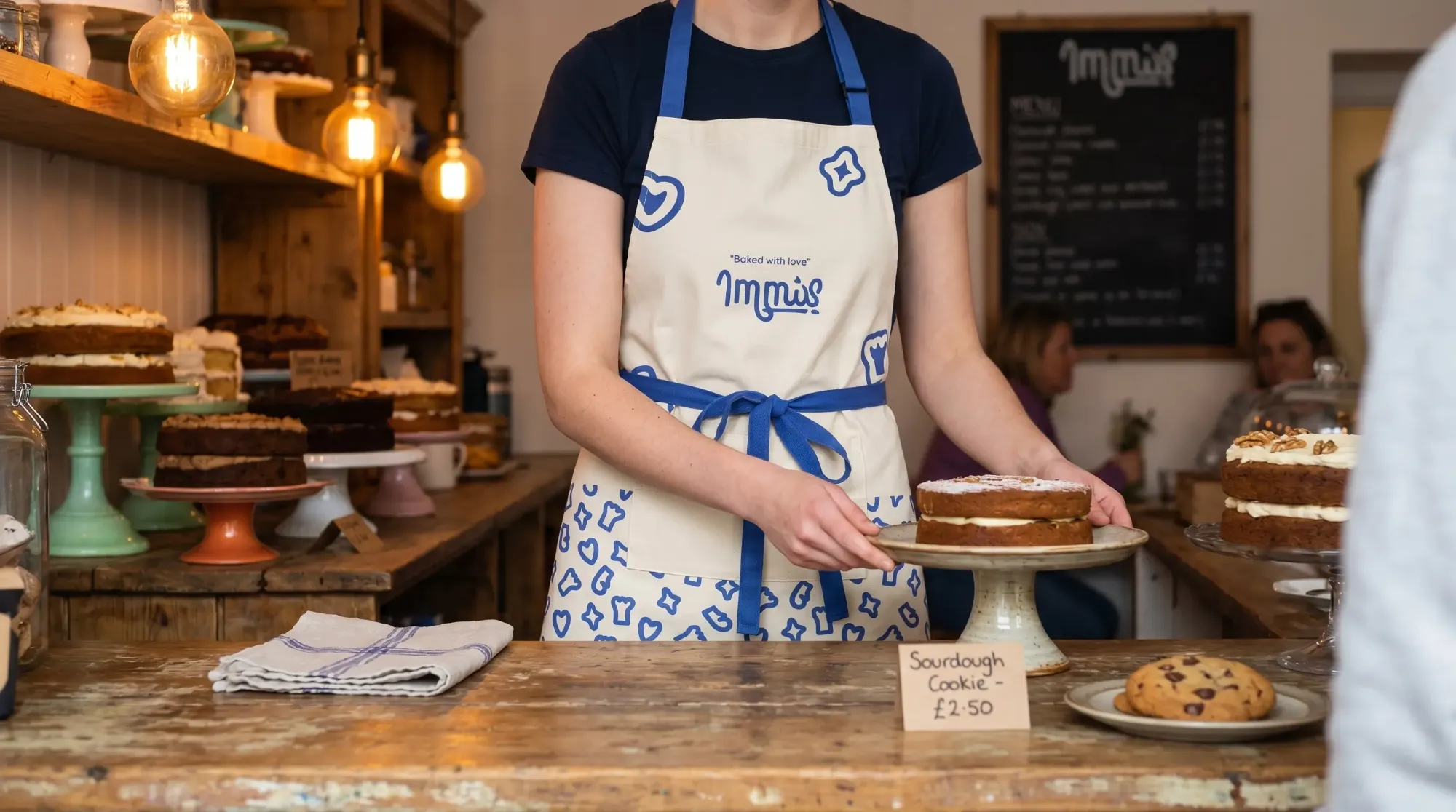
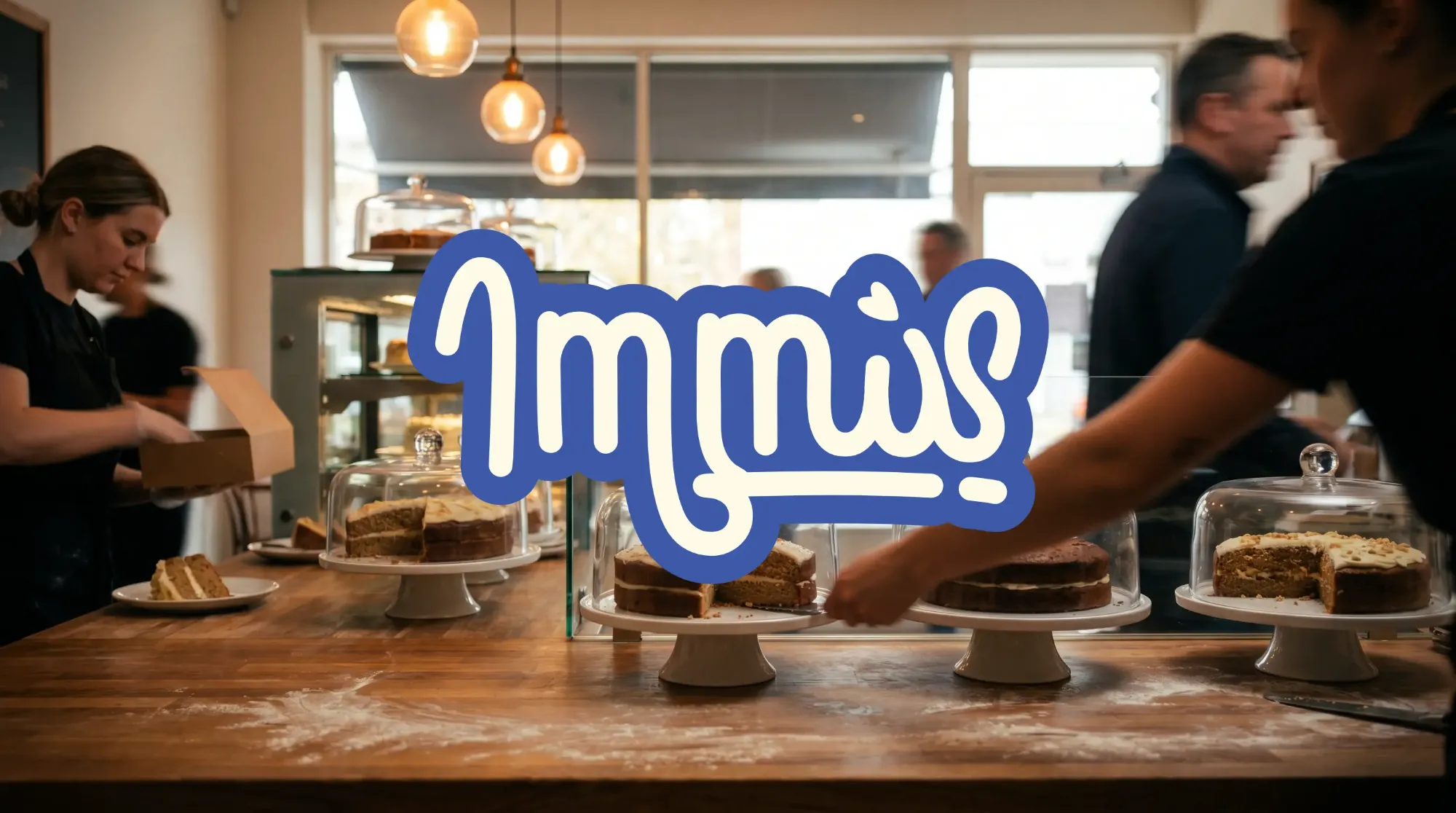
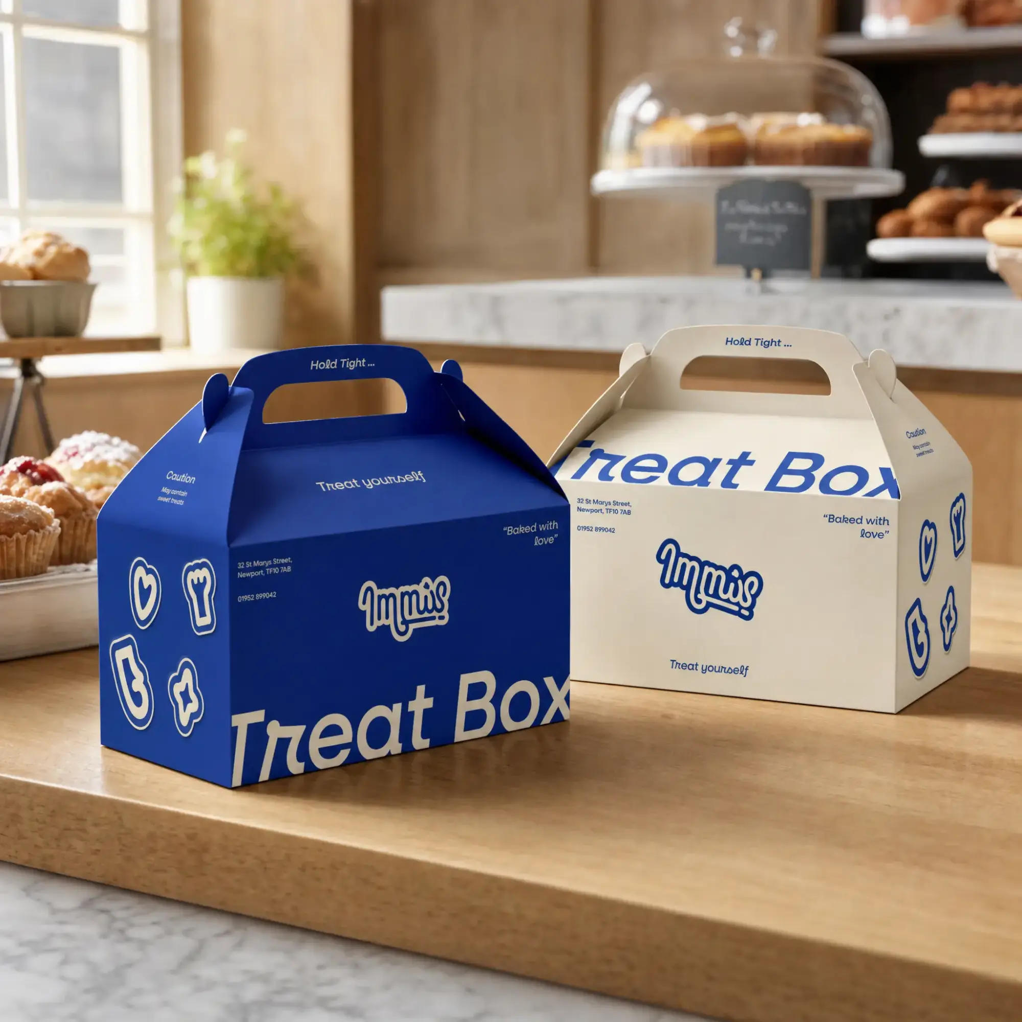
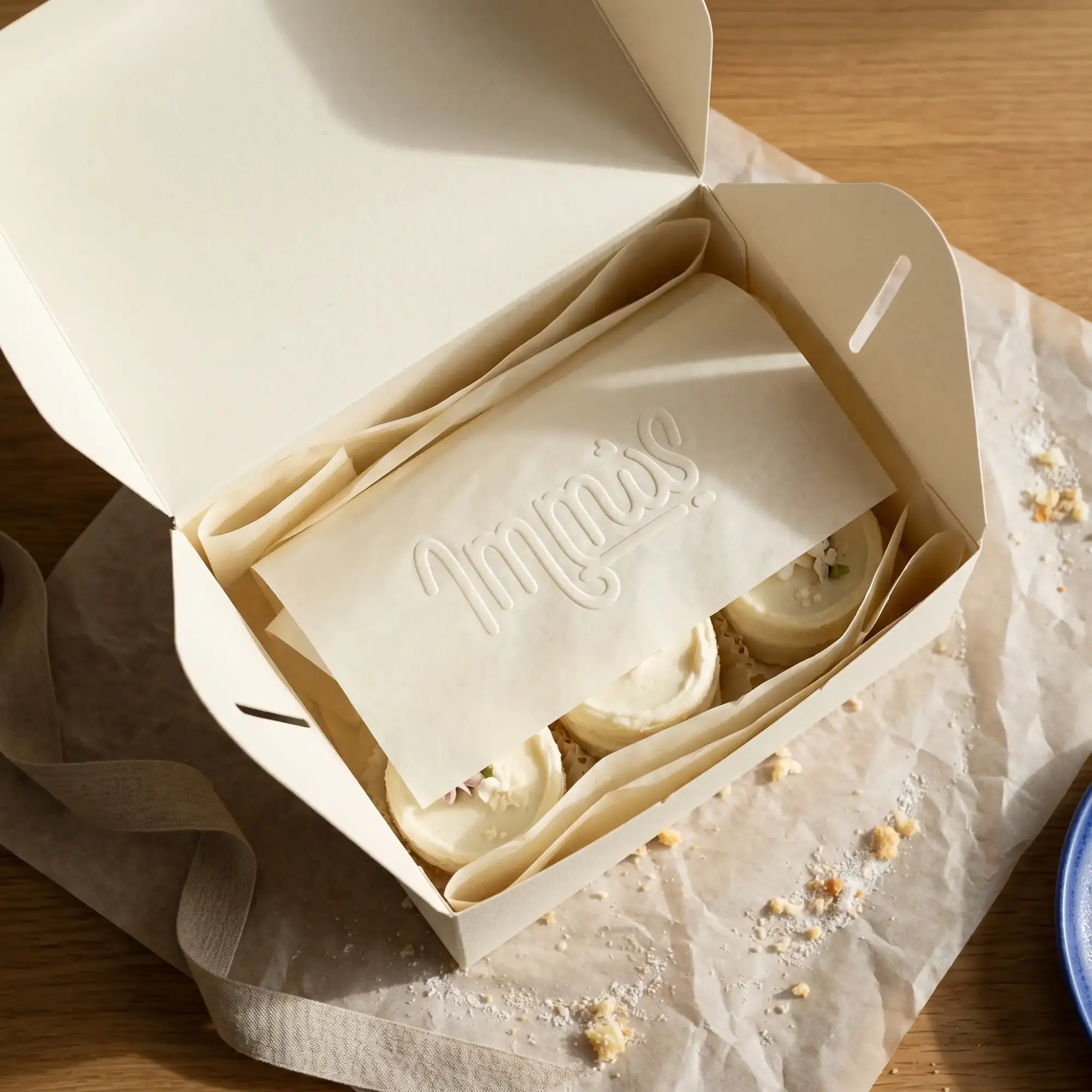
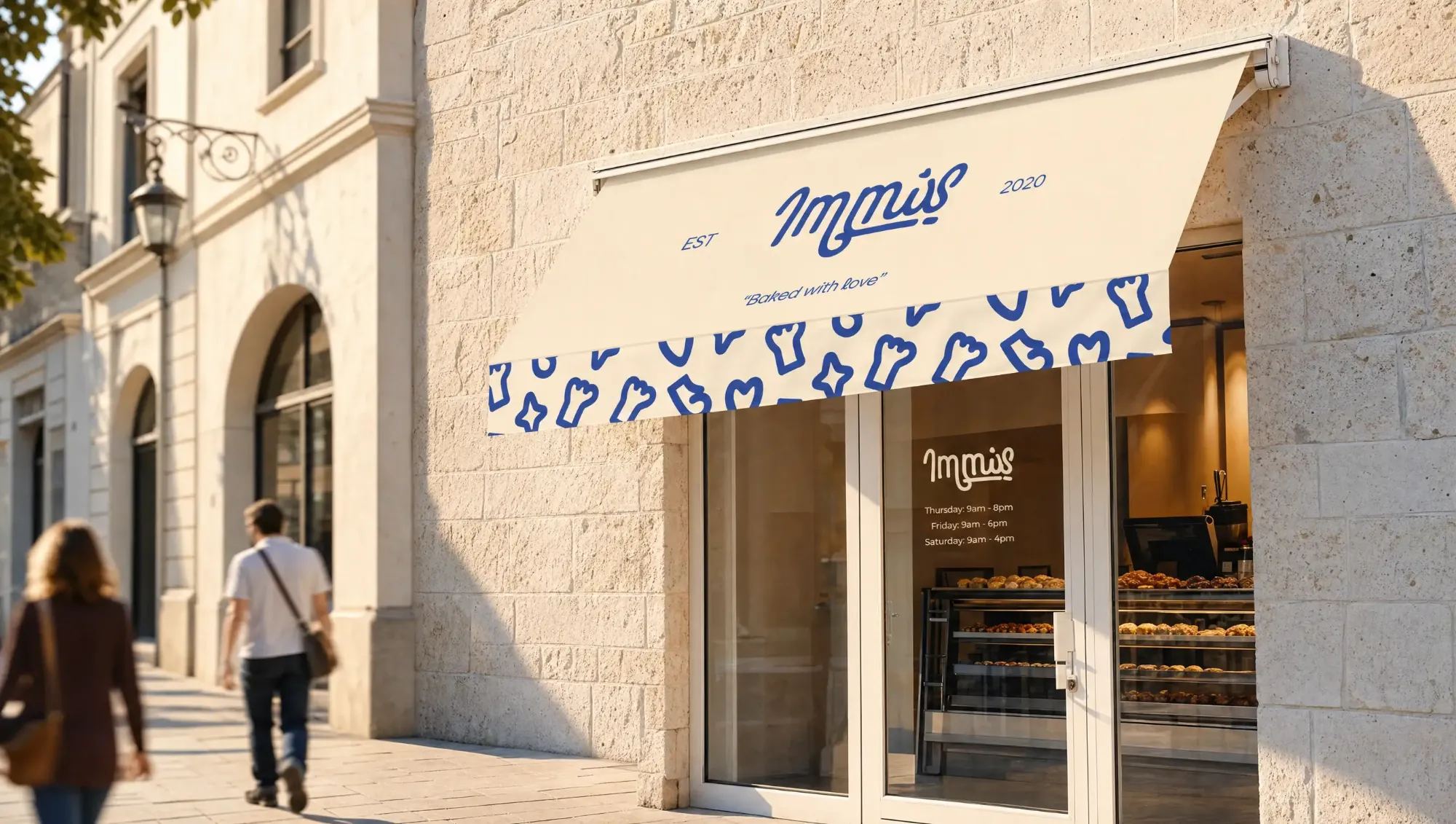
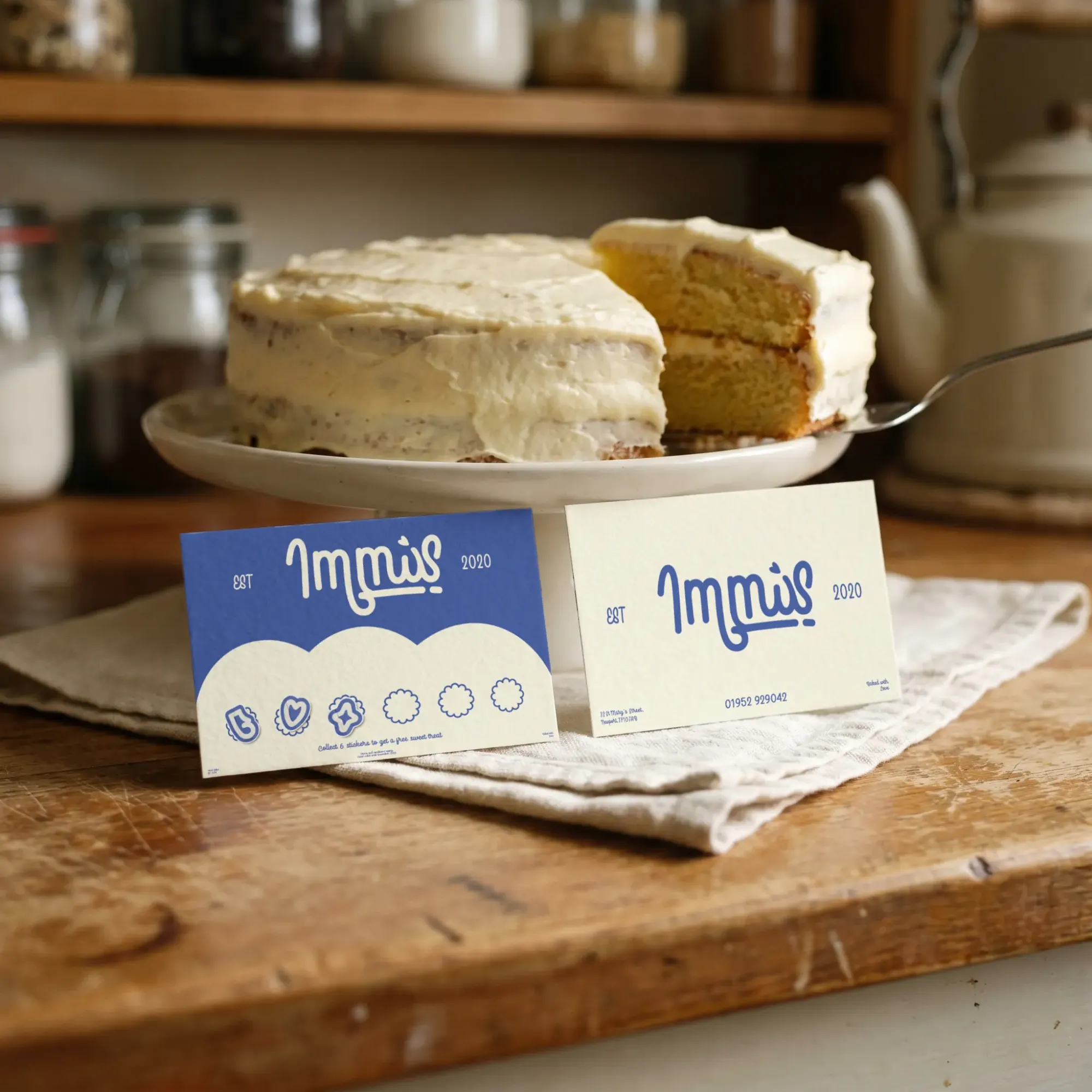
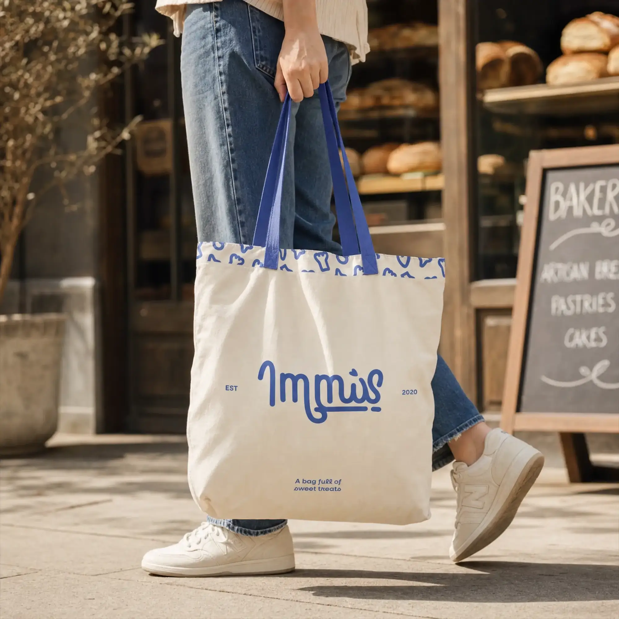
The process began by refining the brand name to Immis, creating a cleaner and more memorable identity that feels modern and easily scalable. This simplification allows for greater flexibility across applications while strengthening overall brand recognition. The logo was designed to feel fluid and expressive, using soft, flowing forms to reflect the brand’s warmth and approachability. An abstract oven glove is subtly incorporated, acting as a nod to Immis’ baking roots while keeping the mark distinctive and ownable. The visual identity was further developed through a refined colour palette. The existing blue was retained and elevated into a more striking tone, paired with a warm cream to add softness and a more premium feel. Limiting the palette to three core colours ensures the brand remains modern, cohesive, and playful. Typography was chosen to be both bold and stylish, adding a sense of personality and confidence to the brand. This balance of expressiveness and clarity helps create a more personal connection with the audience. Together, these elements form a cohesive and adaptable identity system—one that preserves Immis’ charm while positioning it for growth across multiple touchpoints.