Case study
02
/
04
Velvet Waltz
Client
Velvet Waltz
Sector
Film
Scope
Poster Design
Year
2026
The short of it
A truly exciting and diverse project that brings out the essence of UK film production.
The brief
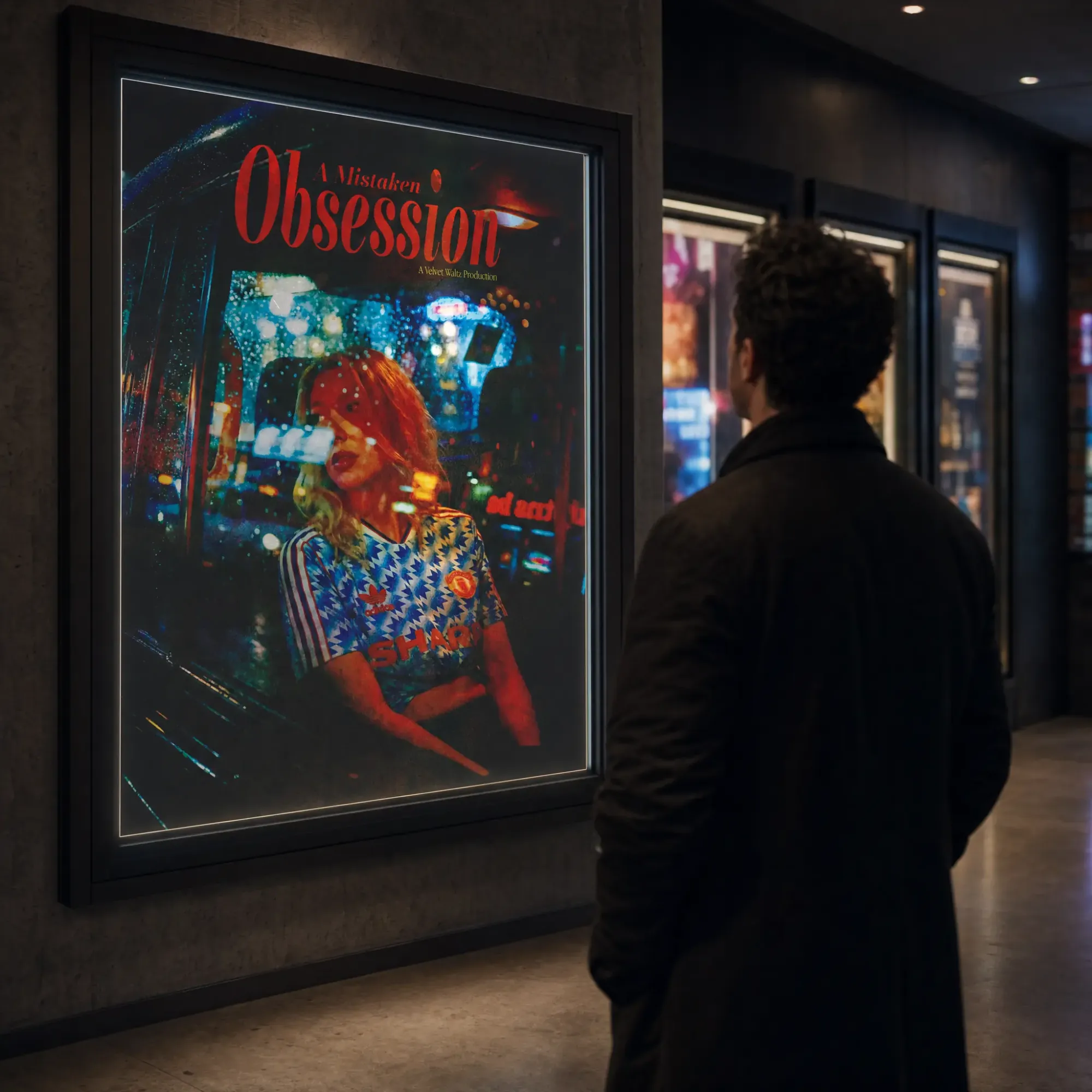
Velvet Waltz is entering production on a new feature film, A Mistaken Obsession. To support the release, a cohesive and strategically planned advertising campaign is required from the early stages of production through to the film’s premiere. The primary focus of this project is the development of a series of posters that will be distributed throughout the production period to build anticipation and audience interest. These posters will form the backbone of the film’s physical advertising strategy. In addition, the visual style and imagery established within the poster designs will extend into a wider digital campaign, informing the film’s social media and online presence. Consistency across these platforms will be key in creating a recognisable and engaging identity. The overall objective is to generate intrigue and curiosity—encouraging audiences to question the narrative and seek out more information about the film ahead of its release.
The idea
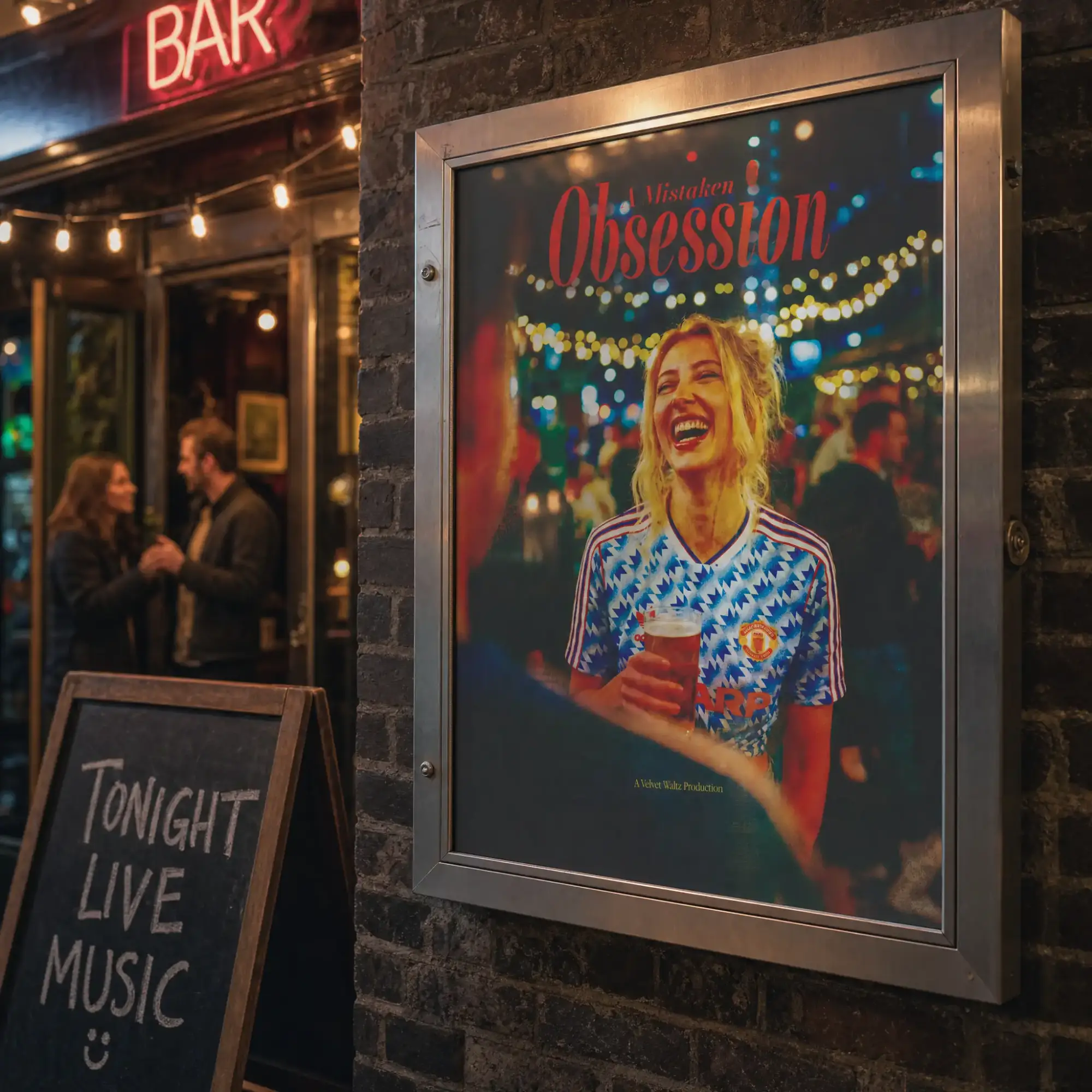
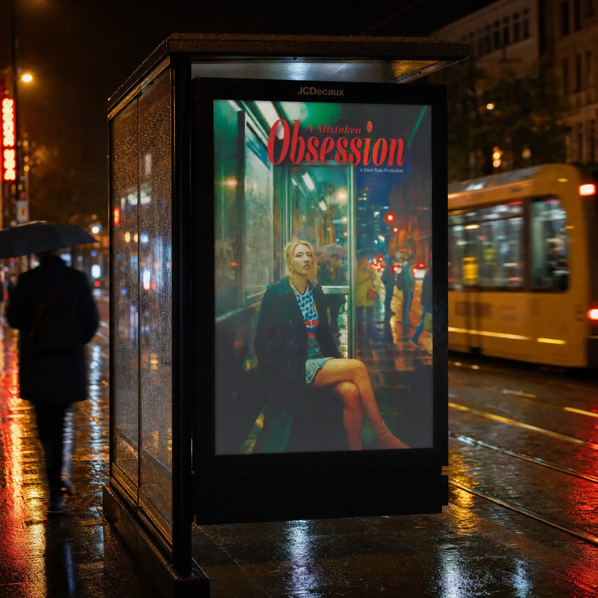
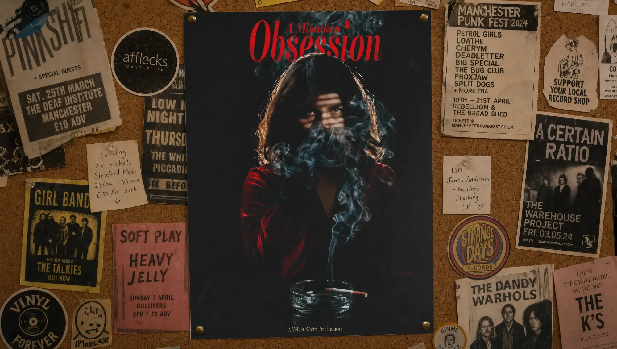
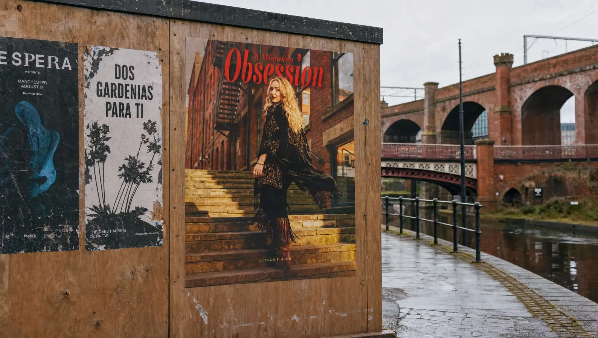
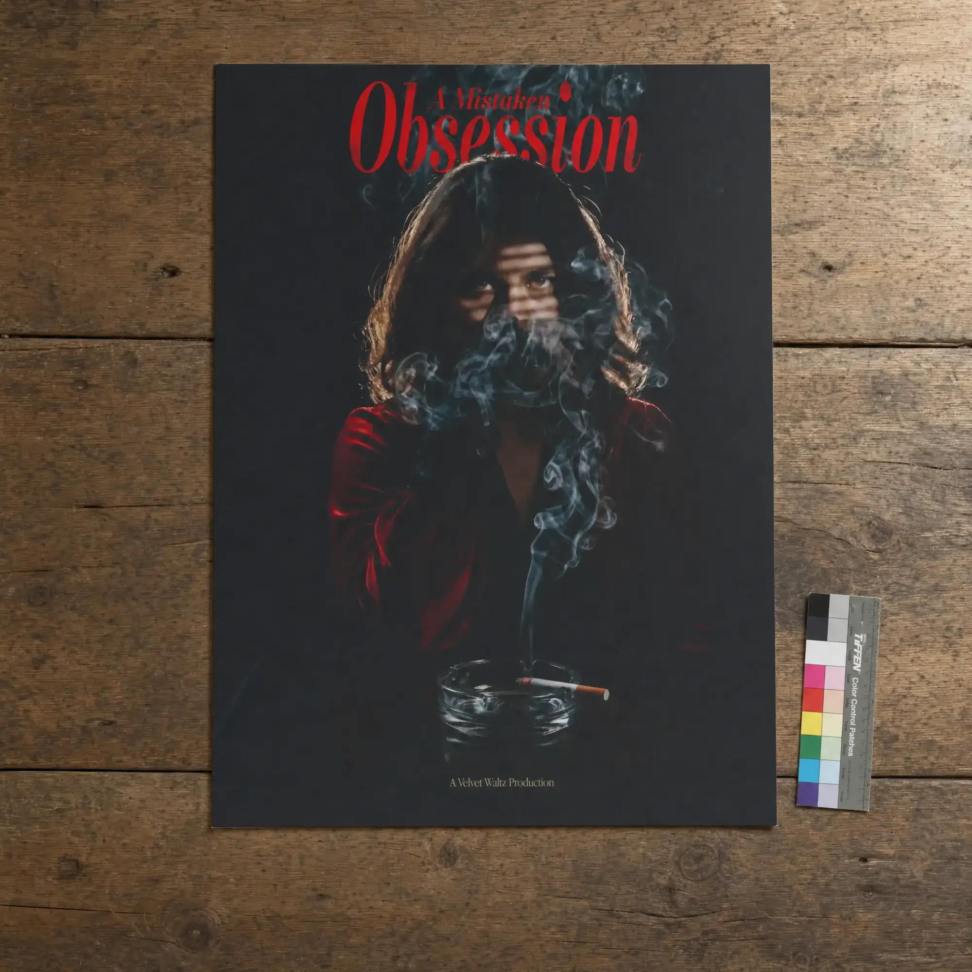
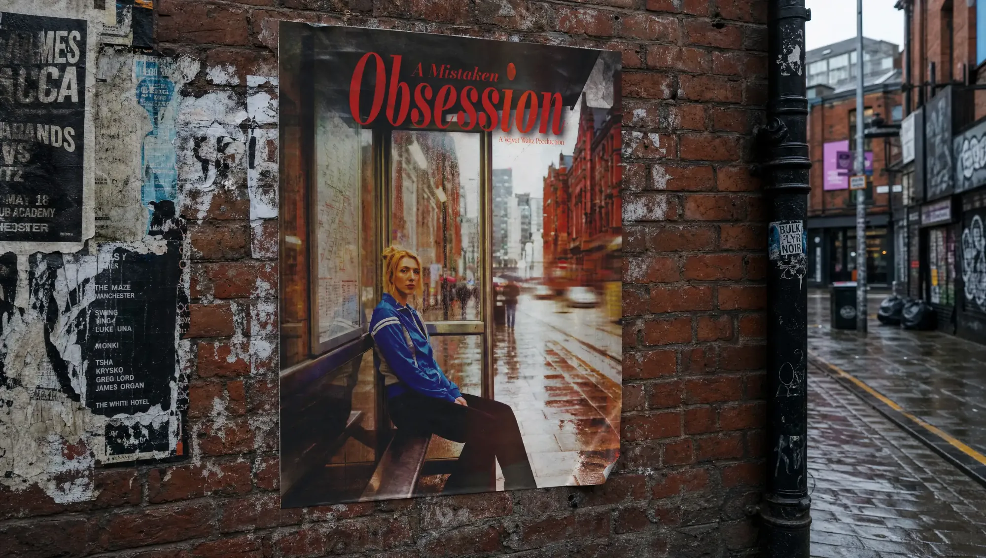
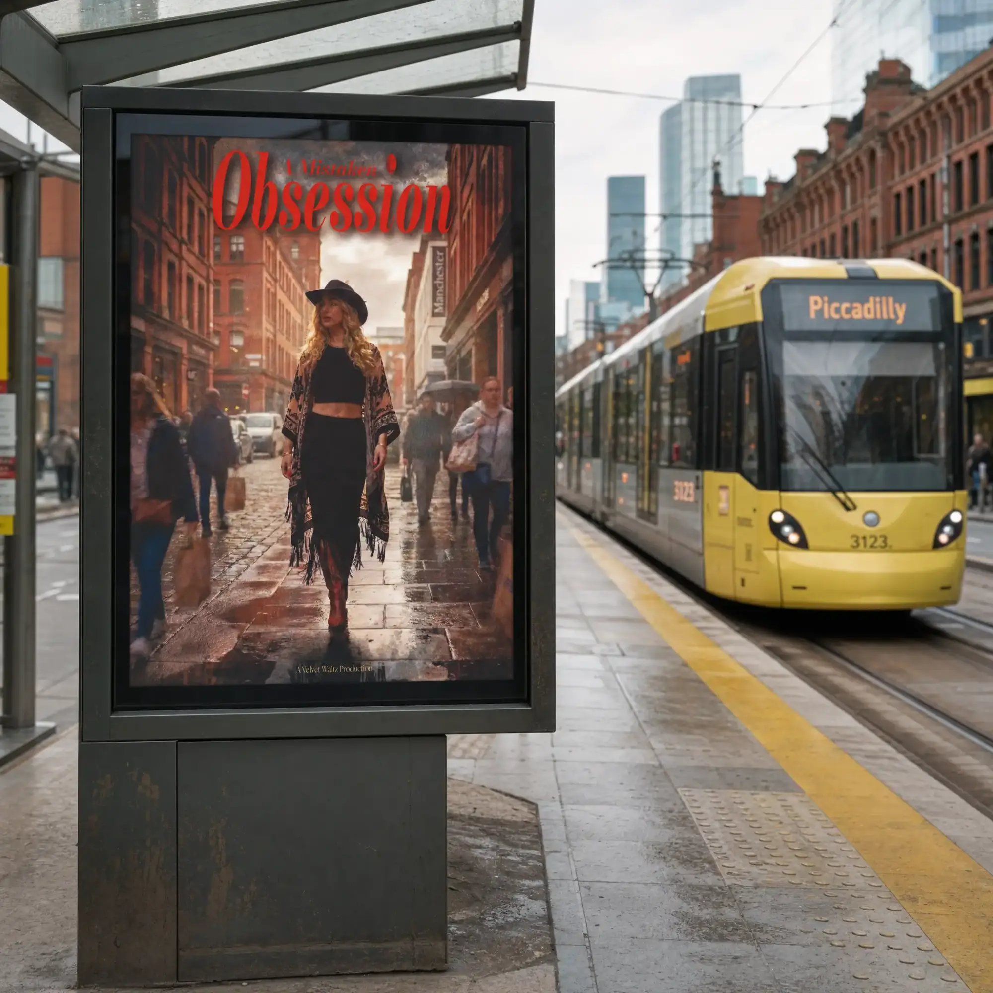
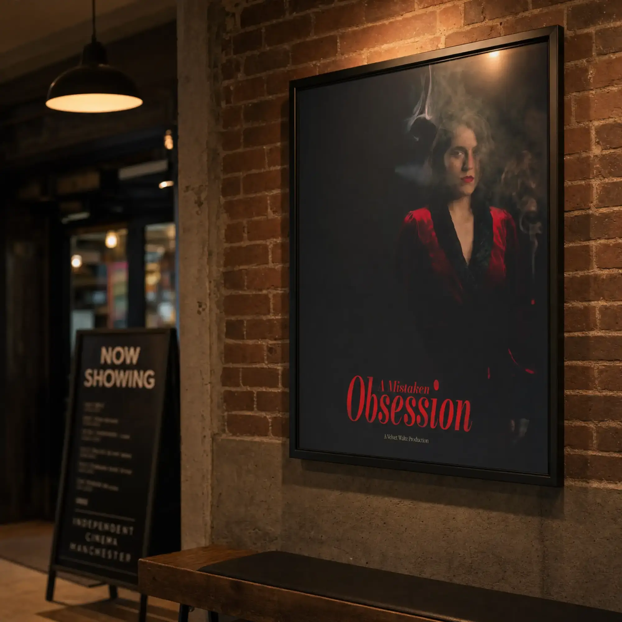
A Mistaken Obsession is, at its core, a gripping story of desire and danger: a charming student’s fixation on a magnetic young woman draws him into a violent game where he is nothing more than an expendable piece. This project embraces the tension, iconography, and grit of classic neo-noir film posters. The characters sit firmly at the forefront, with each poster acting as a showcase for the cast—visually capturing their personalities and hinting at their roles within the narrative. The aim is to build intrigue, allowing mystery to unfold and draw the audience in. From the outset, one element remained constant: this world is unmistakably Manchester. The tone, atmosphere, and visual language are deeply rooted in city life, embedding a raw, urban energy throughout the work.
The doing
We chose a distinct dark, gritty direction that embraces a moody and mysterious tone across the entire series of posters and supporting social media content. Texture and personality are conveyed through considered composition and minimal typography, allowing the imagery and photography to take centre stage and carry the narrative. Alongside the posters, we also created a series of social media adaptations that extend this visual style, ensuring a cohesive identity across digital platforms while translating the same impact into a scroll-stopping format. Each character informed the visual approach, with every poster designed to reflect their individual personality and behaviour. For example, Sally Cinnamon is portrayed as enigmatic and observant, often positioned in the shadows or background. This approach gave us the creative freedom to explore each character in depth, presenting them in a way that feels both authentic and intriguing. The outcome is a cohesive body of work that establishes the tone of the film while building anticipation ahead of its release—sparking curiosity and encouraging audiences to question, interpret, and engage with the story before ever seeing it on screen.