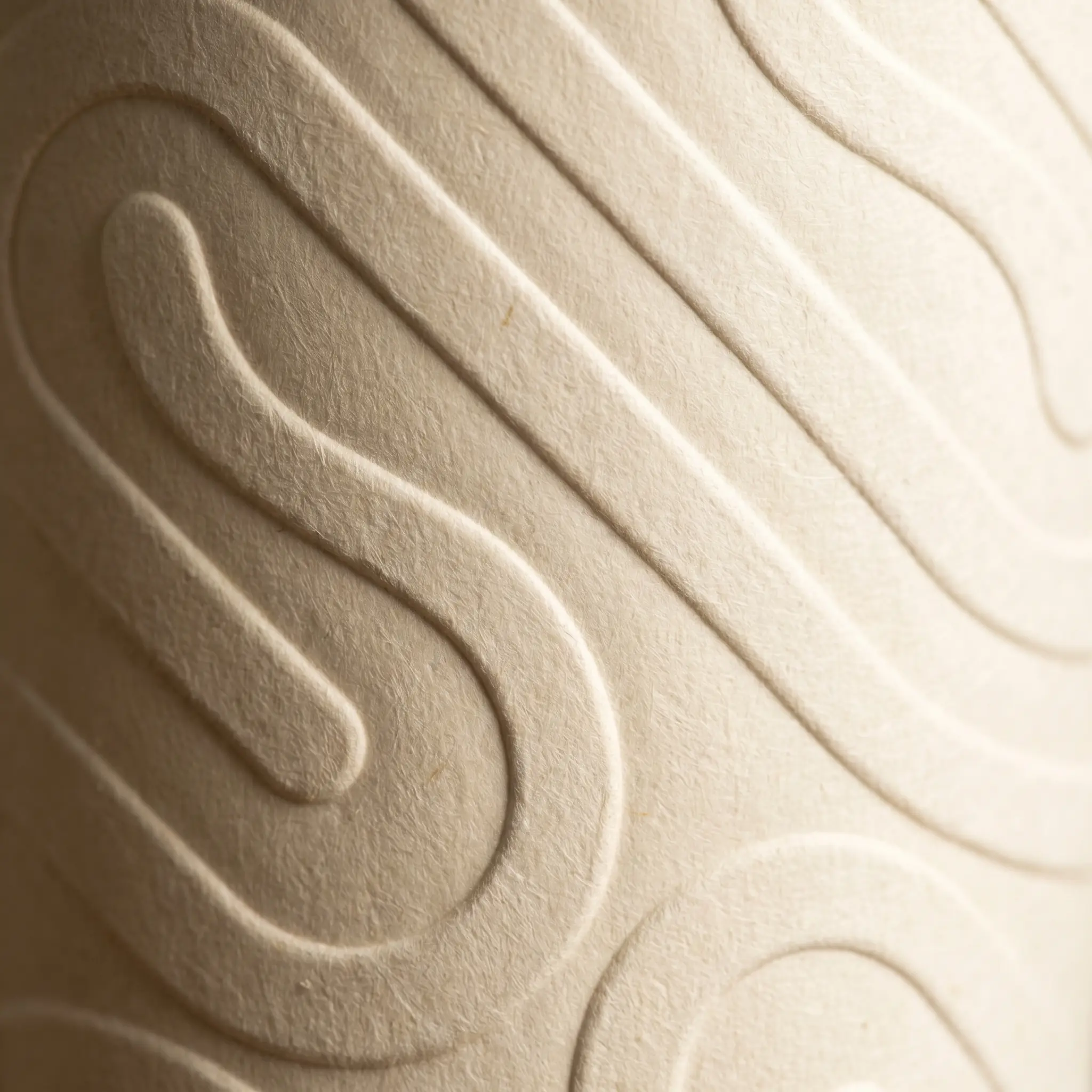
Case study
04
/
04
Willow & Hearth
Client
Willow & Hearth
Sector
Coffee
Scope
Full Brand Identity
Year
2025
The short of it
A concept brand identity for a Hearthy coffee shop with endless warmth. Everyone needs a coffee project
The brief
Willow & Hearth is an artisan coffee house and roaster nestled in the heart of Seattle. More than just a café, it's a warm and welcoming space where people come together to work, relax, and connect over something genuinely good. Rooted in quality and sustainability, they serve expertly crafted coffee made from ethically sourced beans — grown on their own family farm in Washington State — alongside fresh, thoughtfully prepared food and plant-based options. Community sits at the heart of everything they do, from supporting local artists to hosting events that bring people together and foster creativity and connection. As the brand grows, the brief was clear: develop a fresh, versatile identity that truly reflects their story, their values, and the cosy, community-driven atmosphere they've worked so hard to create. One that lives seamlessly across every touchpoint — from mugs and packaging to signage, social media, and their website — so that wherever a customer encounters Willow & Hearth, they feel it instantly.



The idea
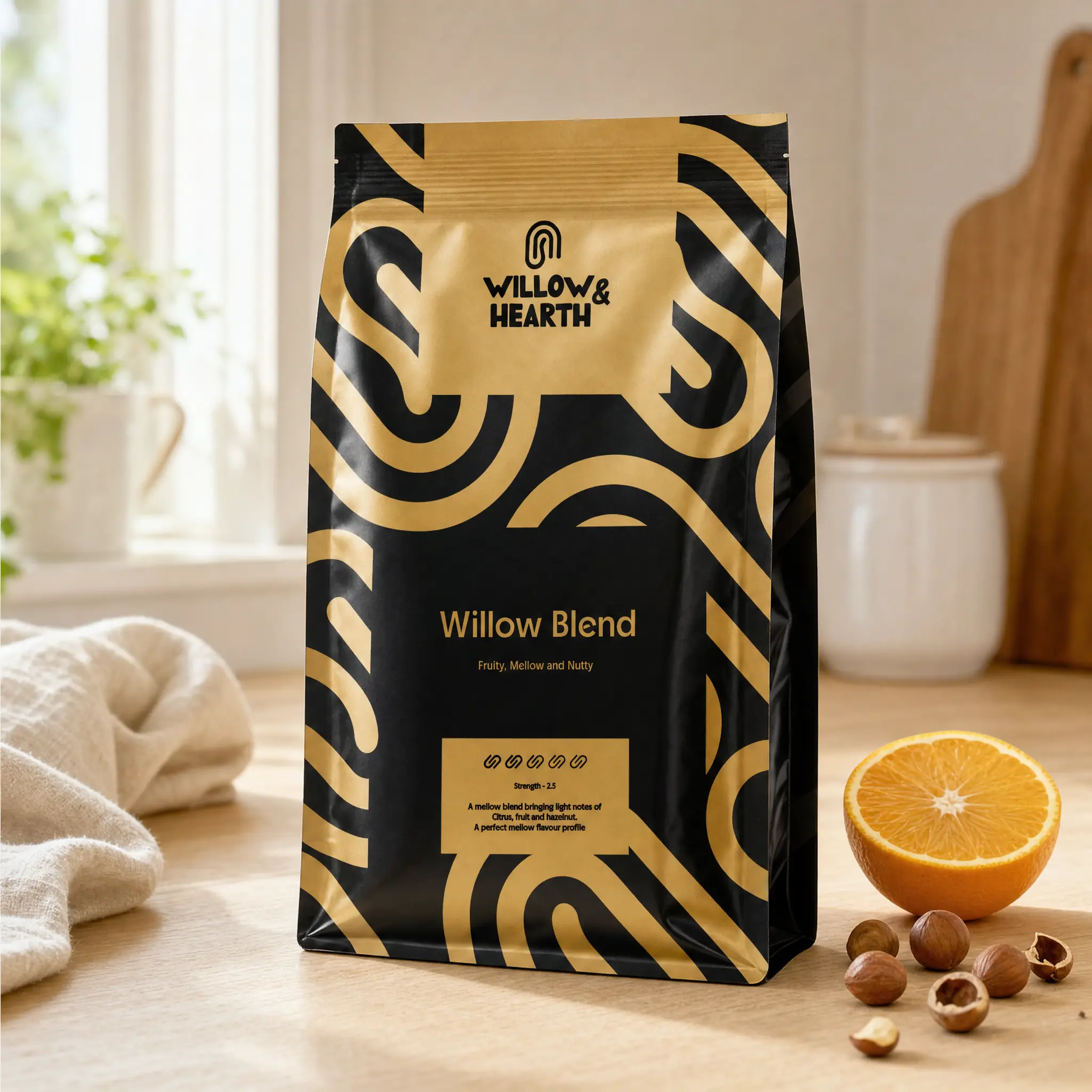
Willow & Hearth is a coffee shop with a bold personality and a warm soul — and the logo needed to say exactly that. The warmth of a crackling fireplace, the calm of a willow tree, the kind of place where you catch up with old friends, make new ones, and linger a little longer over the perfect flat white. Our focus was on carrying the charm of the brand across every touchpoint — making sure none of that handcrafted personality got lost along the way. A coffee shop and home roaster like this doesn't lack character, so the real job was making sure the identity wore it proudly. No sharp edges. Soft, flowing curves and a distinct silhouette that locals would come to recognise — and feel something for — long before they even stepped through the door.




The doing
The process began by hand — sketching, exploring, and letting the concept breathe before a single pixel was placed. From those early drawings emerged a mark that brings together two worlds: the hearth and the willow, abstracted into something soft, fluid, and entirely its own. The final logo strikes a balance between warmth and calm. Earthy, neutral tones were chosen to ground the identity in the brand's artisan roots — nothing loud, nothing sharp, just a palette that feels as considered and honest as the coffee itself. With the mark and colour story established, the identity was rolled out across every touchpoint that matters most. Packaging and cups carry the brand into customers' hands — quite literally — while shop signage brings Willow & Hearth to life on the high street with the same quiet confidence. Social media templates ensure that the personality remains consistent and recognisable, whether someone discovers the brand in person or online. Throughout every application, the goal remained the same: to let the true nature of Willow & Hearth speak for itself — warm, handcrafted, and genuinely transparent in everything it stands for.